CSS Flexbox Tutorial
Contents of the Flexbox Tutorial
In web design, the term Layout refers to the way in which a website is displayed on the screen. In the world of mobile devices and a variety of different screen resolutions, responsive web design is more important than ever before. Today, a website must adapt to the needs of the user and present the content clearly. A good layout ensures that the website is easy to access and that all content is intuitive to find.
Besides CSS Grid, Flexbox (CSS Flexible Box Layout Module) is one of the two most important techniques for creating flexible layouts.
Flexbox is a one-dimensional layout model. This means that Flexbox handles either rows or columns, but never both together. Flexbox is particularly recommended if you want to arrange several elements either row by row or column by column.
In contrast to the previously used Float Model, Flexbox is designed to create flexible and responsive layouts. For this reason, very powerful and convenient options are available for aligning adjacent elements.
Flexbox Basics
Flexbox is based on a parent element (Flex Container) that contains a number of child elements (Flex Items). The display: flex property is used to tell the container that Flexbox is to be used. The properties defined in the flex container are inherited by all flex items.
Flexbox only affects direct child elements of the flex container. All other nesting is ignored.
Style a Flexible 3-Column Layout with Flexbox
/* Define the Flex Container */
.flex-container {
  display: flex;
  padding: 0;
  background: #dbdbdb;
  border: 2px solid #000000;
}

/* Define Flex Items */
.flex-container > .box {
  padding: 0.5em;
  font-size: 1.25em;
}

.flex-container > .box:nth-item(1) {
  background: #f82828;
  color: #000000;
}

.flex-container > .box:nth-item(2) {
  background: #94bbcc;
  color: #000000;
}

.flex-container > .box:nth-item(3) {
  background: #a2cc92;
  color: #000000;
}
Using Flexbox to Flexible Placing of DIV Elements with Flexbox
<div class="flex-container">
  <div class="box">Box 1</div>
  <div class="box">Box 2</div>
  <div class="box">Box 3</div>
</div>
Using Flexbox to Arrange DIV Containers in Horizontal Direction
Without further CSS rules, the flex items will be inserted into the flex container from left to right if there is little content in them.
If there is more content in the boxes, it is distributed over the available space.
Distribute the Space Between Flex Items Along the Main Axis
Lorem ipsum dolor sit amet, consetetur sadipscing elitr, sed diam nonumy eirmod tempor invidunt et labore.
Duis autem vel eum iriure dolor in hendrerit in vulputate velit esse molestie consequat, vel illum dolore eu feugiat nulla facilisis at vero eros et accumsan et iusto odio qui blandit praesent luptatum.
Ut wisi enim ad minim veniam, quis nostrud exerci tation ullamcorper suscipit lobortis nisl ut aliquip ex ea commodo consequat. Duis autem vel eum iriure dolor in hendrerit in vulputate velit esse molestie.
Nam liber tempor cum soluta nobis eleifend option congue nihil imperdiet doming id quod mazim placerat facer possim assum. Lorem ipsum dolor sit amet.
At vero eos et accusam et justo duo dolores et ea rebum. Stet clita kasd gubergren, no sea takimata.
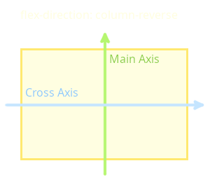
There are two axes in the flex container – the Main Axis and the Cross Axis. By default, the main axis runs horizontally from left to right, while the cross axis runs vertically from top to bottom.
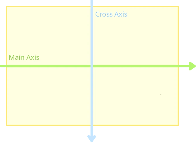
Flexbox is particularly useful when you need to position two or more elements side-by-side or top-to-bottom in a given area.
When it comes to design the entire layout of a website, CSS Grid is more suitable, as it was designed specifically for this purpose.
The flex items are arranged along the main axis and all have the same height. The flex-directionproperty of the container is used to change the direction of the main axis.
The following values are valid:
-
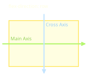
flex-direction: row: the items are arranged horizontally from left to right. -
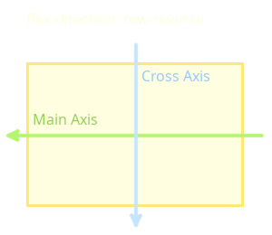
flex-direction: row-reverse: the items are arranged horizontally from right to left. -
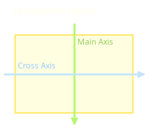
flex-direction: column: the items are arranged vertically from top to bottom. -
flex-direction: column-reverse: the items are arranged vertically from bottom to top.
flex-direction: row is the default value.
The following example uses flex-direction: column to rotate the direction of the main axis. This causes the items to be arranged vertically from top to bottom.
Rotate the Main Axis of the Flexbox Clockwise Using flex-direction
/* Define the Flex Container */
.flex-container {
  display: flex;
  padding: 0;
  background: #dbdbdb;
  border: 2px solid #000000;
  flex-direction: column;
}

/* Define Flex Items */
.flex-container > .box {
  padding: 0.5em;
  font-size: 1.25em;
}

.flex-container > .box:nth-item(1) {
  background: #f82828;
  color: #000000;
}

.flex-container > .box:nth-item(2) {
  background: #94bbcc;
  color: #000000;
}

.flex-container > .box:nth-item(3) {
  background: #a2cc92;
  color: #000000;
}
Position DIV Elements of the Flexbox Vertically
<div class="flex-container">
  <div class="box">Box 1</div>
  <div class="box">Box 2</div>
  <div class="box">Box 3</div>
</div>
Arrange Flex Items in Vertical Direction
The flex-direction property doesn't rotate the two axes together. Only the main axis is rotated. The following images show the orientation of the cross axis in relation to the main axis.
Overview of all flex-direction variants.
Position Flex Items along the Main Axis
By default, the flex items are positioned at the beginning of the main axis. The justify-contentproperty is used to position the flex items along the main axis.
The justify-content property is defined in the flex container.
There are a number of values to position the flex items:
-
justify-content: flex-start: the flex items are aligned at the beginning of the main axis. There may remain free space at the end of the main axis. -
justify-content: flex-end: the flex items are aligned at the end of the main axis. There may remain free space at the beginning of the main axis. -
justify-content: center: the flex items are centered. There may remain free space at the beginning and end of the main axis. -
justify-content: space-between: the first flex item is aligned at the beginning of the main axis, and the last flex item is aligned at the end of the main axis. The remaining items are evenly distributed along the main axis. Spaces are created between the items. -
justify-content: space-around: the flex items are evenly distributed along the main axis, just like withspace-between. However, there is a space before the first item and after the last item. -
justify-content: space-evenly: the flex items are distributed evenly on the main axis, just like withspace-around. But all the spacing is equal.
justify-content: flex-end is not the same as flex-direction: row-reverse.
While the first variant positions the last flex item on the right, the other variant completely changes the order of the flex items and positions the first flex item on the right.
Position Flex Items on the Cross Axis
The justify-content property is used to align items on the main axis. However, if you want to align the content on the cross axis, you have to use the align-items property.
The align-items property is defined in the flex container.
A number of options have been implemented in Flexbox to position items on the cross axis.
The following values are possible:
-
align-items: flex-start: the flex items are aligned at the beginning of the cross axis. There may remain free space at the end of the cross axis. -
align-items: flex-end: the Flex Items are aligned at the end of the cross axis. There may remain free space at the beginning of the cross axis. -
align-items: center: the flex items are centered. There may remain free space at the beginning and end of the cross axis. -
align-items: stretch: the flex items are stretched so that they completely fill the space along the cross axis. The flex items should not have a property that specifies the length along the cross axis (e.g. height -
align-items: baseline: the flex items are aligned to the baseline of the flex container.
Similar to the justify-content property, which controls the alignment of the items along the main axis, the align-content property is used to align the flex items along the cross axis.
The align-content property is defined in the flex container.
align-content only has a visible effect when there is more than one line of flex items.
-
align-content: flex-start: the flex items are aligned at the beginning of the cross axis. Free space may remain at the end of the cross axis. -
align-content: flex-end: the flex items are aligned at the end of the cross axis. Free space may remain at the beginning of the cross axis. -
align-content: center: the flex items are centered. Free space may remain at the beginning and end of the cross axis. -
align-content: space-between: the first flex item is aligned at the beginning of the cross axis, the last at the end of the cross axis. The remaining items are distributed evenly along the cross axis. Spaces are created between the items. -
align-content: space-around: the flex items are distributed evenly on the cross axis, just like with space-between. However, there is a space before the first item and after the last item. -
align-content: space-evenly: the flex elements are distributed evenly on the cross axis, just like with space-around. But all spacing is equal.
Standard Properties of the Flex Items
Besides positioning the items via the flex container, the items themselves can also be customized. There are also some useful properties for this purpose.
Classic CSS properties and the Box Model can be used to customize the items. There are also the Flexbox properties
flex-grow,
flex-shrink and
flex-basis,
to adjust the size of the flex items.
Control Relative Resizing of Flex Items.
/* Define the Flex Container */
.flex-container {
  display: flex;
  padding: 0;
  background: #dbdbdb;
  border: 2px solid #000000;
}

/* Define Flex Items */
.flex-container > .box {
  padding: 0.5em;
  font-size: 1.25em;
}

.flex-container > .box:nth-item(1) {
  background: #f82828;
  color: #000000;
  flex-grow: 1;
  flex-shrink: 1;
}

.flex-container > .box:nth-item(2) {
  background: #94bbcc;
  color: #000000;
  flex-grow: 3;
  flex-shrink: 3;
}

.flex-container > .box:nth-item(3) {
  background: #a2cc92;
  color: #000000;
  flex.grow: 1;
  flex-shrink: 1;
}
Make Flex Items to Grow Relative to Each Other
<div class="flex-container">
  <div class="box">Box 1</div>
  <div class="box">Box 2</div>
  <div class="box">Box 3</div>
</div>
Relative Distribution of the Flex Items Along the Main Axis
-
flex-grow specifies whether the flex item may grow in size.
The flex-grow property defines the grow factor for the distribution of free space if the flex container is larger than the combined sizes of its items. This factor specifies how much of the remaining space in the flex container should be allocated to the main size of the flex item. The remaining space is the size of the flex container minus the sizes of all flex items.
The main size is either the width or the height of the item, depending on the value of the flex-direction property.
flex-grow specifies how a flex item will grow relative to other items. The default value is 1.
If multiple flex items have
flex-grow: 1they share the available space in equal shares.flex-grow: 2doesn't mean that the item will become twice as large as items withflex-grow: 1. It only means that its share of growth is twice as large as the share of items withflex-grow: 1.flex-grow: 0means that the flex item will not grow. -
flex-shrink specifies wether the flex item may shrink in size.
The flex-shrink property specifies the shrink factor of a flex item. If the size of all flex items is larger than the flex container, the items can shrink according to their shrink value so that they fit the container. The negative space of each flex line is distributed to all flex item of the flex line that have a flex-shrink value greater than 0.
flex-shrink specifies how much the flex item will shrink relative to the rest of the flex items in the container when negative space is distributed.
The flex-shrink factor takes the base size into account to prevent smaller items from shrinking to 0 before larger items are noticeably reduced.
-
flex-basis specifies the initial size of a flex item along the main axis. The property determines the size of the Content Box.
If flex-basis is set to a value not equal to auto, and a width (or height in case of
flex-direction: column) is set for the same flex item, the flex-basis value will override the width/height setting.If flex-basis is not set for the item, the width (or height in case of
flex-direction: column) value of the item is used.
It is recommended to use the flexshorthand property instead of using separate flex-grow, flex-shrink, and flex-basis declarations.
flex accepts one, two or three values.